IPIO Management Portal Update

The IPIO portal is used by Monitoring Centre (ARCs) and Installers to manage IPIO units.

We have just completed an upgrade to the Portal bringing even more power and features to monitoring centre professionals. Here are some of the key new features:

Web Interface

  • Cleaner, easier to read at a glance
  • Improved typography and spacing throughout
  • IPIO Inputs and Outputs in a pop up window just like in the app
  • Auto Refresh every 15 seconds
  • Hide offline units from the list of units
  • Pin states have been re-drawn to give a cleaner appearance
layerednewipio2530

Figure 1: The IPIO Portal offers comprehensive management features for IPIO units

webuiIPIO

Figure 2: WebUi for IPIO Controls matched with App rendering

Micro notifications

  • New notification alarms for online / offline events
  • Hide notifications from appearing
event_tray

Figure 3: Event tray for online/offline events

Event logs

    • Comprehensive event logs
    • New “change to schedule” event added
    • Colour coded easy to read event list
    • Transfer users from one unit to another
eventlogs

Figure 4: Cleaned up event logs

Users

  • Notification tray added so you can see missed online/offline events
  • Change a user’s role feature added
  • Can change portal password direct from the portal when logged in
usersettings

Figure 5: Move users from one unit to another


Team Matters

We are pleased to announce that Sean Duffy will be joining our team of Security Automation developers. Sean is not exactly new to EyeSpyFX. He spent a student placement year with us in 2018/9. He then worked with us part time while he finished his degree studies. He graduated in 2020 with first class honours in Computer Games Development from the University of Ulster. During his final year he won a prestigious prize for best Mobile Technologies project. Sean also has a keen interest in electronics and cars. He is an excellent all round “maker” and is a perfect fit for EyeSpyFX. We are delighted he is now joining us in a full time role.

Welcome aboard Sean.

seand


New IPIO rules feature

IPIOrulesIPIO has a new programmable rules feature. (IPIO app v3.03 onwards)

Using the rules feature the app can be programmed to carry out an action based on an input event. For example: If the gate opens (input 1) then disarm alarm (output 1) and switch on lights (output 2).

The rules feature is ideal for building up sophisticated I/O behaviours on monitored sites.

The IPIO rules feature does not appear to all users. It is a powerful feature and only appears to users who have Portal Access. This enables site managers working in the ARC to create rules while not burdening end users with user interface elements that they will not use.

IPIO rules are based on “if that then this” type logic. If input 1 is triggered, then output 2 will arm.

There is a rules simulator feature that visually models the rule. Outputs can be matched, flipped or oppose an Input state.

There is a second section to rules (not shown above) that allows multiple outputs to follow each other. For example, if Output 2 is armed, then arm Output 3.

We would be pleased to hear about your applications based on rules, and we look forward to making the rules section even more powerful and responsive and intelligent in due course.

Eight observations about IoT app development that have become our values.

We began working on IoT and security camera applications in 2002. Over the years we have made some observations that have become our development values.

Intelligent
An app is only part of an IoT system. It is the part of the system that the user touches and it is often the only way that the users experience the system. Behind the App screen there are appliances, cloud services, computation, storage, API’s, connectivity, time, etc. All of these elements combine to give the end user an intelligent effect and control rendered seamlessly in the mobile app. We think of the intelligence of the app in the context of the whole system performance.

Comprehensible
A powerful complex app cannot always be simple and easy to use but it must be comprehensible. IoT apps can be hard to understand because the app provides just a limited window on a partially hidden system. IoT apps often involve actions that occur automatically. This can disorientate a user. We work hard to make unavoidably complex merged physical and computational environments comprehensible.

Agency
Apps can be agents working on your behalf. The user interface is a place where you set up rules and adjust preferences. Once set up the app should run semi independently. When something happens in the system that requires human attention the app should bring the issue to the user’s attention setting out the causes and possible remedies.

Aware
An app should remember what you did in a particular context – and help you achieve that outcome again if the context is similar

Secure
We stand over all our code. There are no black boxes of unknown code components.  All storage is encrypted. All communications are encrypted and authenticated.

Fast
We count the clicks. Each click is valued. The UI time is measured. The server and appliance response times are also measured.  We indicate the total process expected and elapsed time. Communicating what is expected and when it is expected is part of making the app experience comprehensible.

Reliable
100% reliability is not possible even if the system is as simple as a kitchen light switch. Reporting, mitigation and notification are all strategies that we use to help manage reliability failures in complex IoT systems.

Authenticated
There are competing forces. It is critical to know who is doing what and that permissions are appropriate and manageable. It is also critical for the user to know that the system is secure, true and responsive. Competing against that is the chance that security layers are over burdensome for activities that don’t need to be secure. We get the balance right.

Also see Navihedrons

Technology Readiness Levels

We have been working on a number of projects recently featuring TRL appraisals. Here is a handy reference TRL 1 to 9. We found it a useful way to think about long term R+D IoT projects and where they are at any one moment.

  • TRL 1 –basic principles observed
  • TRL 2 –technology concept formulated
  • TRL 3 –experimental proof of concept
  • TRL 4 –technology validated in laboratory
  • TRL 5 –technology validated in relevant environment (industrially relevant environment in the case of key enabling technologies)
  • TRL 6 –technology demonstrated in relevant environment (industrially relevant environment in the case of key enabling technologies)
  • TRL 7 –system prototype demonstration in operational environment
  • TRL 8 –system complete and qualified
  • TRL 9 –actual system proven in operational environment (competitive manufacturing in the case of key enabling technologies or in space)

Fulll TRL descriptions here: https://techlinkcenter.org/technology-readiness-level-dod/


Posted in IoT

Arm and Disarm monitored video alarms

IPIO800

IO Device

IPIO is a cloud based I/O device. It is designed for arming and disarming monitored video alarms and or opening gates. It can be used to replace a keypad. The IPIO device is robust and can be wall or table mounted.

End user Apps

IPIO Android and iOS mobile apps can support many IPIO sites. We have some customers with 100’s of sites, other with 10’s and for those with just one site the app auto configures to skip the site selection page (left). There are two levels of user, Manager and Guest.

Once you have entered a site in the app you can arm all – to secure the premises entirely or simply arm a zone (centre). All buttons can be renamed or removed from the app interface.

A full log of events available to Managers provides a full evidence trace of who arms or disarms and when (right).

Monitoring Centre Portal

For monitoring centres there is a web portal where all IPIO units can be monitored and managed.

IPIOtriplefinal

Find out more here: https://www.eyespyfx.com/ipio.html

Observations about Agent apps

An app for that
Golden Krishna explained the “No UI” concept in his famous 2013 talk “The best interface is no interface”.
https://www.youtube.com/watch?v=iFL4eR1pqMQ
Others have spoken of “Invisible design”.
https://www.intercom.com/blog/invisible-design/

Part of what is underlying these ideas is the concept that a system will help the user to get rid of certain small tasks. Who needs a door handle when you can have an automatic sliding door?

The idea that there is “an app for that” and this and everything has led to some world weary tiredness. That combined with the knowledge that a phone is a computer which can of course automate tasks leads to a sense that there simply must be a better way forward than making more dumb apps.

Minimal chrome
Most of the apps we build in EyeSpyFX are apps for viewing Security Camera Systems. The concepts of #NoUI or #Invisibledesign do not really apply to EyeSpyFX – the apps we build are necessarily visual, driven by the main function – viewing cameras. Nonetheless, we have tried to reduce the percentage of UI (sometimes derided as chrome) in our apps. For example, we have worked on Camera Apps where we put the camera stream as the main content and only introduce UI elements when the context demands. We have also tried to hide the pesky UI chrome behind a side-swipe away navigation bar. Another strategy we tried is to use semi transparent UI elements. All of these strategies reduce the UI and attempt to bring content to the user with minimal UI interactive hassle. All that is just good design rationalisation but you still wind up needing to go to the app, turn it on and look at stuff and take an action – the same as it ever was. All minimal UI strategies fall far short of automation, short of intelligence and short of a computing promise where things just happen on your behalf, good things, on time and appropriate – like automatic sliding doors.

Recent EyeSpyFX projects in the area of access control have enabled us to build apps that are closer to true #NoUI. Our interpretation of #NoUI is an app that is essentially a settings configuration tool. It is where you set up an agent service. Once set up and under normal circumstances the app does everything on your behalf without any further involvement from you. When the app does need your intervention, it sends you a rich notification enabling you to choose to take an action without opening the app.

Agent apps
The app is a context aware agent acting on your behalf, responding to conditions according to settings you have programmed in. A design challenge in apps like that is not so much how to convey how to use the app, it is how to convey how to programme the app to have a particular behavior in some future set of circumstances. It can be difficult to balance computational sophistication and power with comprehension and useability. In our projects we are trying to make #NoUI come true. We are  building intelligent effects combining the thing (camera, access control unit) with the cloud service, sensors inputs and user profile. We are still mid-project but we can make the following observations:

  1. It is not easy to get right (we keep on finding exceptions)
  2. The app needs to able to run in the background and make server calls in the background. We have encountered permission issues, privacy issues and variation in phone OS performance.
  3. Loss of connectivity problems. What happens to an automated service when it losses connection?
  4. You need to able to override the agent service with an immediate manual activation.
  5. You need to able to develop a UI that enable the user to understand, model and edit the process before and during the operation.
Programmable app UI

Programmable app UI


Navihedrons and Roy Stringer

I met Roy Stringer at an academic conference in Glasgow School of Art in ~1998. He was there talking about his Navihedron concept (It was a co-incidental meeting, I was at the conference speaking about a different subject). Something about Roy Stringer and his Navihedron idea made me remember it all this time.

Stringer’s idea was that an icosahedron (12 vertices’s, 20 edges, 30 surfaces) could be effectively used as a navigation system to present non linear content. Each point of the icosahedron would be a subject heading. Each point can be clicked. Two things happen when a point is clicked; 1. The Navihedron animates bringing the clicked point to the frontal position, 2. content relevant to the clicked point subject heading appears in a frame or content area located adjacent to the Navihedron.

It is a very pleasing effect. The animation is engaging. The viewer can revolve the Navihedron exploring the 12 points. Each point has five geometrically related points that offer the next step in the story. The viewer can create their own path through the story. It allows users to browse in a natural way and yet remain within a cohesive story. In comparison linear presentations seem rather boring. The key to it may be that the reader can select their own entry point rather than the start of a linear story. They can click on the point they are interested in. That point is the start to their story. Once they have selected their start they can control their own story rather than being directed through numbered linear pages.

When Stringer presented the Navihedron in 1998 a user could sign on to Navihedra.com and build their own Navihedron and edit the headings. The idea was that a finished Navihedron could be exported and then used in a stand alone website.

Stringer used a physical model of the Navihedron using plastic tubes held together with elastic. Any subject could be explored using the model as a tool and prompt. I have made a few of these over the years and they are a great three dimensional connection between information and space.
navi2
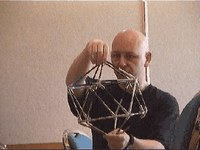
Roy Stringer showing opposite points. Image credit: https://katiesvlog.blogs.com/vlog/2006/03/ted_nelson_at_t.html

Stringer felt that the Navihedron might be useful to enable students to put together a story about a subject they were studying. As an example of this I made a sketch showing a Navihedron in the context of a school history class about the Vietnam war. It is not a linear presentation of history – you can enter from any point of interest.
vietnamnavihedron
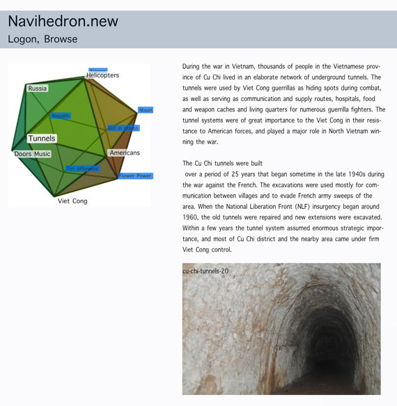
Authors sketch of a Non Linear history lesson style Navihedron

The Navihedron idea has had a wide reach. For example Andy Patrick formerly of Adjacency recalls Stringers influence in the Design of the early years of dot.com ecommerce sites including the Apple store.

Stringer was inspired by Ted Nelson who in 1965 first used the term “hypertext” to describe:
“nonsequential text, in which a reader was not constrained to read in any particular order, but could follow links and delve into the original document from a short quotation”.
Nelson says that HTML is what they were trying to prevent in his project XANADU. “HTML has “ever-breaking links, links going outward only, quotes you can’t follow to their origins, no version management, no rights management”.

Here is the brilliant, thoughtful, Ted Nelson talking about the structure of computing, ZANADU and Transclusion.

(En passant: don’t miss these great Ted Nelson one liners)

Roy Stringer sadly died very young in 2000. Although his work had huge impact, somehow, Stringers Navihedron Site has disappeared from the web, actually it has fallen victim to what Nelson quips as a world of “ever-breaking links”. In fact I could not find any working Navihedron.

navihedra-com
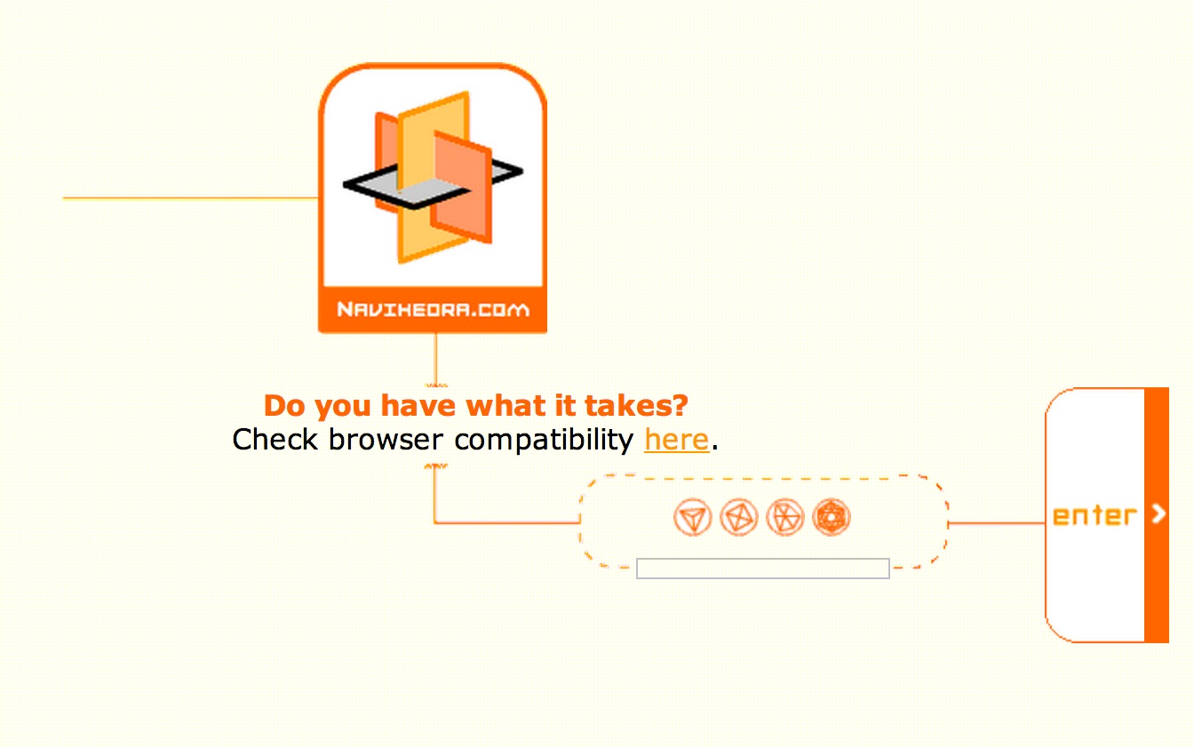
Image Credit: The front page for access to Navihedra.com from Alan Levine‘s memories of Roy Stringer: https://cogdogblog.com/

Perhaps there is something in Stringers Navihedron work that has been superseded by the all pervading paradigm of web based navigation. The menu at the top, sub menu down the side or dropping down, style website (this one included) has become dominant.

Daniel Brown of Amaze (the company Stringer founded) helped to develop the Navihedra site and he points out that Stringer’s original Navihedron was built using Shockwave. That technology has now been largely replaced by CSS and Java Script.

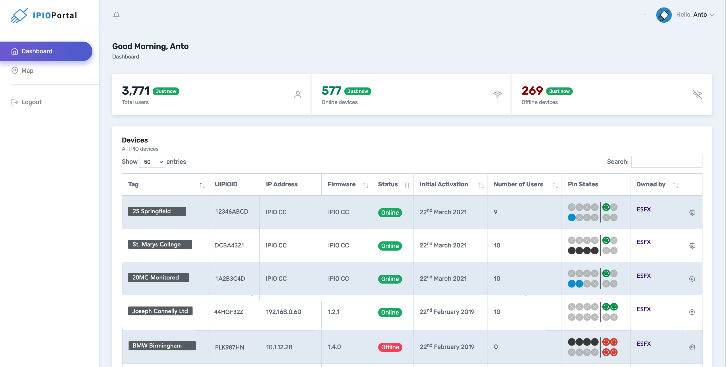
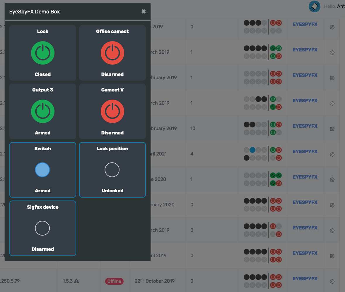
In EyeSpyFX we set out to see if we could rebuild a Navihedron using modern web friendly technologies. The Navihedron you see here is a cube and not an icosahedron as Stringer originally proposed – but the storytelling concept is essentially the same. We built it driven by curiosity really – just to see if we could do it. It is not quete performing as we intend but I think it is a good start (controllable and animated if viewing on a PC (browser dependent), just animated if viewing on Mobile). We would like to build more and in time develop it into a fully editable system for creating Navihedrons – we are searching for the commercial reason to push it forward. The Navihedron concept is intriguing – perhaps a lost web treasure. Fully implementing a Navihedron using web technologies is surprisingly difficult– it is going to be a long term project. This blog article and demo is just a step in the general direction.

App Life

Some iOS apps are now in their 10th year. In the EyeSpyFX app portfolio we haven’t got any that old – but we have some 7, 8 and 9 year olds. One of our apps, “My Webcam” would have been over ten years old but we retired it two years ago. In fact that app would be in its 16th year had it survived. Before its iOS manifestation “My Webcam” had a life on Blackberry and before that as a Java app on Nokia and Sony Ericsson.

Apps get discontinued for lots of reasons, for example:

  • Removed by the app store due to lack of updates
  • Competition from other apps
  • The app store closes
  • The original reason for the app does not exist anymore
  • No sustainable commercial rationale
  • The app function is now an OS function included in standard software
  • App is so bloated it is difficult and expensive to update
  • App was built using a previous development environment and re-factoring it is not worth the cost
  • The app gets subdivided into smaller apps

Memory of “My Webcam” prompts me to reflect on the life cycle of apps in a general sense. I wonder if you could go to the app store and do a filtered search by date of publication what the average app life would be. In ten years time will there be apps that are 20 years old?

Our experience as developers is that as apps grow old they also grow bigger and then even bigger as more time passes and features get added.

There are some practical limits to app growth. Ultimately an app has to fit on a phone shaped screen and there is a limit to how many buttons you can fit in. If you keep adding functionality and features to an app year after year it inevitably becomes bloated. The bloated app – perhaps now resembling something more like “enterprise software” departs from the very concept of an app: “a small neatly packaged part of the internet”.

So why do apps grow? Top reasons include:

  • We don’t want to have lots of apps – we just want one app so our customers find it easy to choose
  • The PC interface does this – so the app should do it as well
  • The UI on the product does it – so the app should do it as well
  • The user base is growing and we need to give the users new stuff
  • Some of our customers are specialised/power users and we need to support them.

These are good corporate reasons but they strain the app design and tends to forget about the plain old user who wants the app to do the one thing the app name/icon suggests.

Serving everybody also does a disservice to the specialised power user. They come to the app with their special requirement but find their special feature located down the back in an app whose whole design and evolution serves a more general use case.

Rethinking a mature app into separate apps enables the company to specifically serve user requirements, for example; to open the door, to view the camera, check the logs, to disarm the system, to view the recording from 2 weeks ago. It is of course tempting from a corporate point of view to keep all of these functions together in a super security app. However each function has a specific user group in mind. A suite of mini apps could be created with the name of each app reflecting the function or user role.

Subdividing mature multifunctional apps into generation 2 apps can help with making an app easy to understand and use again. The really difficult question is, when is the right time to stop developing and start subdividing?

The point of subdivision can arrive simply because of a corporate internal practical reason, being too costly to maintain for example. A more fruitful sort of subdivision can also occur as a result of a design review – led by users – and to give a new lease of apps – life.

applife